What to put on a one-page business website
By the OnePagey team7 min read
Summary
- OnePagey generates a complete one-page site from your business description.
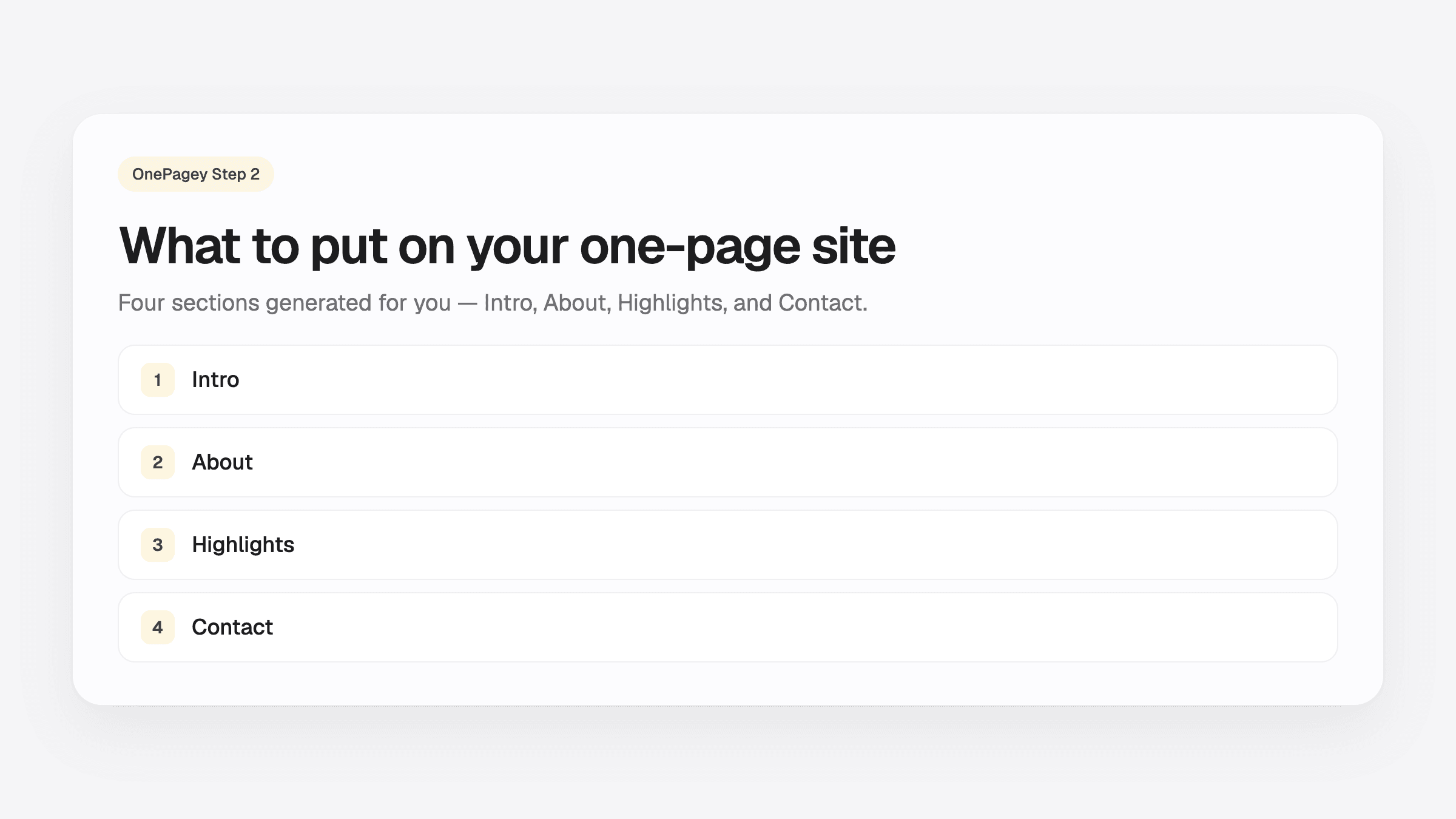
- Every site starts with four blocks: Intro, About, Highlights, and Contact.
- Add Services, Testimonials, a Coming soon banner, or a Custom block on Step 2 only if you need them.
- Launch with the defaults first; refine after you are live.
Most owners get stuck on photos, templates, or copy. They already picked a domain. They still do not know what belongs on the page.
One page answers three questions: what you do, why someone should trust you, and how to reach you. OnePagey builds that structure for you on Step 2: Review & Continue. Your job is to make sure each block says the right thing.
Why one page is enough
A local bakery, plumber, consultant, or salon rarely needs twenty pages on day one. Customers are not browsing your site like a catalog. They land, scan for 10 seconds, and decide whether to call, book, or leave.
One focused page beats a half-finished multi-page site every time. It also costs less. See our 2026 website cost breakdown for why keeping scope small saves money. If you have not launched yet, how to get a website online in 5 minutes shows what to publish first. This guide helps you refine what each block should say.
What OnePagey puts on your page by default
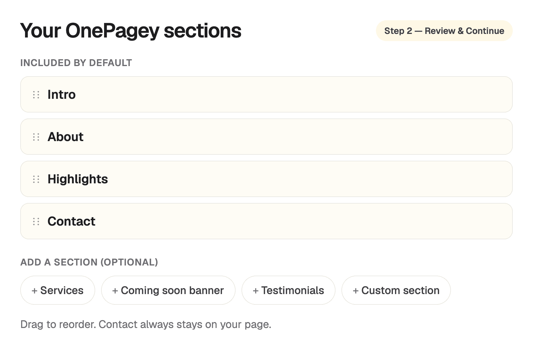
After you describe your business on the landing page and pick a domain on Step 1, OnePagey generates your site. On Step 2 you will see these four blocks in the left panel, the same labels you use to edit and reorder your page:
Intro
This is the first thing visitors see: your business name in the nav, a headline, a short subhead, a hero image, and a Contact button in the header. For Sunrise Bakery, that looks like:
- Headline: Artisan Bakery in Portland
- Subhead: Serving fresh bread, pastries, and custom cakes for weddings and events
- Hero image: A real photo of your product or space. AI picks a strong default; swap it later by clicking the image
Good Intro: specific location or niche + clear offer. Weak Intro: “Welcome to our website” with no hint of what you sell.
About
Two to four sentences on who you are and why you do this work. Enough that a first-time visitor believes you are a real business. Mention years in trade, family ownership, or what you are known for locally.
OnePagey drafts this from your business description. Read it once on Step 2 and tweak anything that sounds off. You can click any sentence after publish to edit it in place.
Highlights
Three to five scannable points. What makes you worth calling today. Think fresh daily bakes, same-day quotes, wedding specialists, or eco-friendly packaging. Short phrases beat long paragraphs here.
This is not a full services menu. If you need a line-by-line list of offerings, add the optional Services block (covered below). Most owners launch with Highlights only and add Services later.
Contact
How customers reach you: phone, email, address, or a simple form. OnePagey always keeps a Contact block on your page. It is the action you want every visitor to take. Your nav Contact button scrolls here.
Double-check the phone number and email before you pay. These are the details people actually use.
Some generated sites also show a slim Trust bar, a row of icons or short proof points between the other blocks. It is a default block you can keep or remove. If it fits your business, keep it; if not, trash it like any other block.
Optional blocks you can add on Step 2
Tap Add a block in the Step 2 panel to insert any of these when they earn their place:
Services
A formatted list of what you offer, up to six items, one per line. Best for salons, trades, consultants, or anyone whose offer is a menu of distinct jobs. Example lines: Haircuts, Coloring, Styling.
Coming soon banner
A banner for businesses not fully open yet. Grand opening date, waitlist, or “now booking for spring.” Remove it once you are trading normally.
Testimonials
A block for customer quotes. Add it when you have real feedback to show. One genuine review beats three generic ones.
Custom block
Freeform title and body for anything else: service area, hours, parking, FAQ snippet, or a short policy note. You set the heading and text; OnePagey styles it to match the rest of the page.
A card for a menu, form, or insurance file you already have. Visitors tap Open PDF and read it in their browser. Use this when you need the real file on the page. Type a price list or add photos when you can. A PDF is the fallback for a document you already designed.
You can drag to reorder, remove blocks you do not need, and jump to a block in the preview using the arrows on each row. A tight four-block page often converts better than eight thin blocks.
Keep day one short
- A full blog or news page
- A photo gallery with twenty images
- Multiple competing CTAs (“Shop”, “Subscribe”, “Follow” all above the fold)
- Long FAQ pages. One Custom block with three questions is enough
- Copying a ten-page competitor when you only need one clear offer
You can add depth later. The goal today is to look credible and make contact easy.
Quick tweaks by business type
Service business (plumber, consultant, dog walker): Consider adding Services if Highlights feels too vague. Put your service area in a Custom block if you work across multiple neighborhoods.
Local shop or café: Default blocks are often enough. Use Highlights for signature products and hours; add Testimonials once Google reviews start coming in.
Pre-launch: Add Coming soon banner, keep Contact prominent for waitlist inquiries, and skip Testimonials until you have customers.
Reorder, colors, and edit after preview
Step 2 is your control panel before payment:
- Your blocks: reorder, remove, or add blocks
- Choose your colors: pick a palette (e.g. Porcelain) that fits your brand; buttons and contact areas update together
- Website preview: scroll the live page on the right before you continue to payment
After publish, open your dashboard and click any text or image to change it. Need a hand? Our support team typically replies within one business day.
Pre-launch checklist
Before you continue to payment on Step 2, confirm:
- Intro headline says what you do and who you help
- About reads like a real business, not generic filler
- Highlights list three to five concrete reasons to choose you
- Contact phone and email are correct
- You have removed any block you do not need
- Optional blocks (Services, Testimonials, Coming soon, Custom) only appear if they add proof
- You checked the preview on your phone width (scroll the preview)
If you checked six of seven, you are ready. Publish and put the link where customers already look for you.
Publish the four blocks
OnePagey starts you with Intro, About, Highlights, and Contact, the same blocks you see on Step 2. Add more when your business needs them.
Pick your domain, preview your page, and publish. Extra blocks, color tweaks, and better photos can happen after the link is live.
Also in this series: How to get your website online in 5 minutes · How to choose a domain name for your small business · How much does a small business website cost in 2026? · Website builder vs WordPress for small business · Do you need a web designer?
Keep reading
More guides on getting a small business online.
- Just formed your LLC? Domain + one-page site checklist
Papers are filed. People still ask for a link. Use this checklist for a .com in your name and a one-page site you can text.
- What to put on your first business page after you file
Intro, About, Highlights, and Contact. That is the first page a new LLC can share the week the papers come back.
- From EIN to .com: simple path for new US small businesses
EIN in the folder. Next, a .com in your name and one page customers can open. Five steps from tax ID to a link you can text.
One-page sites by use case
If you already know the kind of work you do, start on a page written for that job.